card 卡片布局
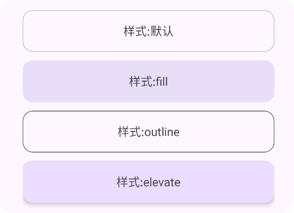
<ui>
    <linear gravity="center" h="max" padding="30" w="max">
        <card h="50" margin="5" type="default" w="300">
            <linear gravity="center" h="max" w="max">
                <text text="样式:默认"/>
            </linear>
        </card>
        <card h="50" margin="5" type="fill" w="300">
            <linear gravity="center" h="max" w="max">
                <text text="样式:fill"/>
            </linear>
        </card>
        <card h="50" margin="5" type="outline" w="300">
            <linear gravity="center" h="max" w="max">
                <text text="样式:outline"/>
            </linear>
        </card>
        <card h="50" margin="5" type="elevate" w="300">
            <linear gravity="center" h="max" w="max">
                <text text="样式:elevate"/>
            </linear>
        </card>
    </linear>
</ui>
卡片布局属性
| 属性 | 值(示例) | 类型 |
|---|---|---|
| style | fill,outline,elevate | 字符串 |
| clickable | true,false | 布尔 |
| ripper | #FF0000 | 颜色 |
| radius | 20 | 浮点数字 |
| bg | #FF0000 | 颜色 |
| padding | [左,上,右,下] | 数字 |
| gravity | center,start,end... | 字符串 |
子控件布局属性
被
card包裹的子控件都可以使用这里的属性
| 属性 | 值 | 描述 |
|---|---|---|
| w | auto,max,数字 | auto是最小包裹,max是最大宽度,数字是按照虚拟像素分辨率(dp) |
| h | auto,max,数字 | auto是最小包裹,max是最大高度,数字是按照虚拟像素分辨率(dp) |
| layout_gravity | 字符串:"fill|fill_h|fill_horizontal| fill_v|fill_vertical|start|end| left|right|top|bottom| center|center_h|center_horizontal| center_v|center_vertical|display_h |display_horizontal|display_v| display_vertical|clip_h| clip_horizontal|clip_v| clip_vertical" | 决定子控件的重力,位置 |
| margin | 数字 1.一个数字:上下左右 2.两个数字:左右,上下 3.四个数字:左,上,右,下 例如:margin="10,15,0,15" | 外边距 |
| padding | 数字 1.一个数字:上下左右 2.两个数字:左右,上下 3.四个数字:左,上,右,下 例如:padding="10,15,0,15" | 内边距 |
| leftMargin | 数字:leftMargin="10" | 外边距 |
| topMargin | 数字:topMargin="10" | 外边距 |
| rightMargin | 数字:rightMargin="10" | 外边距 |
| bottomMargin | 数字:bottomMargin="10" | 外边距 |
| dir | 字符串:dir="rtl"或者dir="ltr" | rtl:子视图会从右侧开始排列 ltr:子视图会从左侧开始排列 |
| resolveDir | 字符串:resolveDir="rtl" | 主要用于解析和获取视图最终使用的布局方向 |