02.详细属性
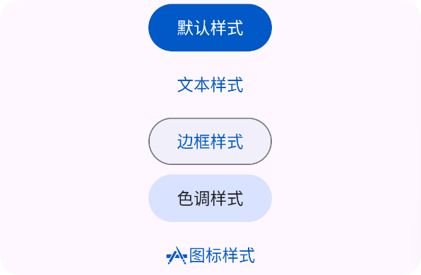
样式
- 使用 style="text" 显示文本样式
样式可选值有: text,outline,icon,tonal
<ui>
    <linear gravity="center" h="max" padding="30" w="max">
        <button text="默认样式"/>
        <button style="text" text="文本样式"/>
        <button style="outline" text="边框样式"/>
        <button style="tonal" text="色调样式"/>
        <button style="icon" icon="ic_app" text="图标样式"/>
    </linear>
</ui>
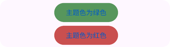
主题色
- 使用 color="#57965C" 设置主题色
<ui>
    <linear gravity="center" h="max" padding="30" w="max">
        <button style="text" color="#57965C" text="主题色为绿色"/>
        <button style="text" color="#C94F4F" text="主题色为红色"/>
    </linear>
</ui>
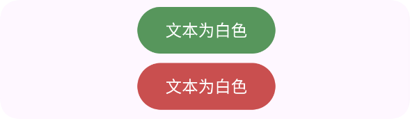
文本颜色
- 使用 textColor="#FFFFFF" 设置文本颜色
<ui>
    <linear gravity="center" h="max" padding="30" w="max">
        <button style="text" color="#57965C" text="文本为白色" textColor="#FFFFFF"/>
        <button style="text" color="#C94F4F" text="文本为白色" textColor="#FFFFFF"/>
    </linear>
</ui>
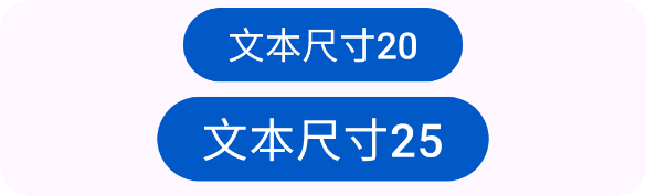
文本尺寸
- 使用 textSize="20" 设置文本尺寸
<ui>
    <linear gravity="center" h="max" padding="30" w="max">
        <button text="文本尺寸20" textSize="20"/>
        <button text="文本尺寸25" textSize="25"/>
    </linear>
</ui>
涟漪颜色
- 使用 ripper="#000000" 设置涟漪颜色
<ui>
    <linear gravity="center" h="max" padding="30" w="max">
        <button style="text" ripper="#000000" text="涟漪颜色:黑色"/>
    </linear>
</ui>

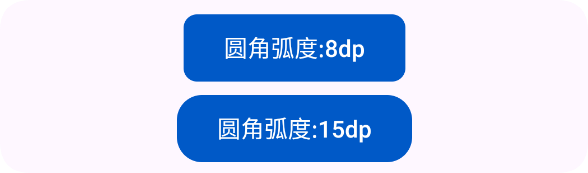
圆角弧度
- 使用 radius="8" 设置圆角弧度(单位:dp)
<ui>
    <linear gravity="center" h="max" padding="30" w="max">
        <button radius="8" text="圆角弧度:8dp"/>
        <button radius="15" text="圆角弧度:15dp"/>
    </linear>
</ui>
内边距
- 使用 padding="20" 设置内边距
<ui>
    <linear gravity="center" h="max" padding="30" w="max">
        <button padding="20" text="内边距"/>
    </linear>
</ui>

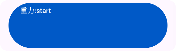
重力
- 使用 gravity="start" 设置重力
<ui>
    <linear gravity="center" h="max" padding="30" w="max">
        <button w="max" h="100" text="重力:start" gravity="start" margin="20"/>
    </linear>
</ui>