01.详细属性
排列方向
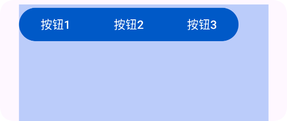
默认情况下:
<button-group>
    <button text="按钮1"/>
    <button text="按钮2"/>
    <button text="按钮3"/>
</button-group>

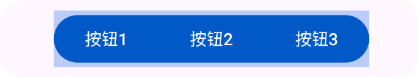
- 使用
dir="h"属性可以将按钮组的排列方向设置为水平排列
<button-group dir="h">
    <button text="按钮1"/>
    <button text="按钮2"/>
    <button text="按钮3"/>
</button-group>

使用单选模式
默认情况下是多选模式
- 使用
singleSelect="true"属性可以将按钮组设置为单选模式。
<button-group dir="h" singleSelect="true" id="mGroup">
    <button text="按钮1"/>
    <button text="按钮2"/>
    <button text="按钮3"/>
</button-group>
注意:在button-group中,按钮的下标是从1开始的,而不是0!
let mGroup = ui.id("mGroup");
mGroup.onCheck((index) => {
    toast("选中第" + index + "个按钮");//1,2,3
});
单选模式,至少选一个
- 使用
selectRequire="true"属性可以将按钮组设置为至少要选中一个按钮(单选模式有效)
<button-group dir="h" singleSelect="true" selectRequire="true">
    <button text="按钮1"/>
    <button text="按钮2"/>
    <button text="按钮3"/>
</button-group>
背景颜色
- 使用 bg="#553574F0" 设置按钮组的背景颜色
<button-group bg="#553574F0" dir="h">
    <button text="按钮1"/>
    <button text="按钮2"/>
    <button text="按钮3"/>
</button-group>
内边距
- 使用 padding="30" 设置按钮组的内边距
<button-group bg="#553574F0" dir="h" padding="30">
    <button text="按钮1"/>
    <button text="按钮2"/>
    <button text="按钮3"/>
</button-group>
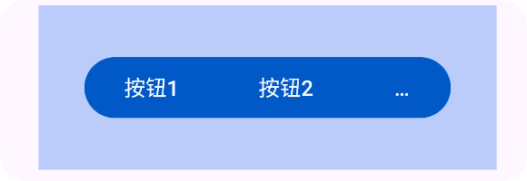
重力
- 使用gravity="start" 设置按钮组的重力
<!--为了更好的演示,添加上背景演示,设置一定的宽高-->
<button-group bg="#553574F0" dir="h" w="max" h="300" gravity="start">
    <button text="按钮1"/>
    <button text="按钮2"/>
    <button text="按钮3"/>
</button-group>